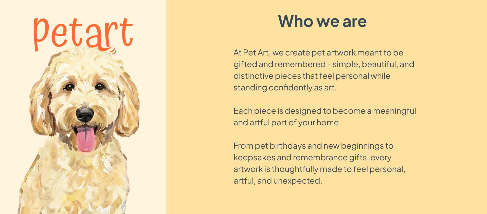
Gift Ideas for Pet Owners: The Custom Impressionist Pet Portrait Guide
Published: 4/12/2026
A custom impressionist pet portrait turns a pet photo into painterly wall art, and it's the one gift for pet owners that doesn't end up in a drawer. This guide covers how to choose the right style for any home.

Picture the last "gift for pet lovers" section you browsed. Enamel pins. Novelty socks. A mug that says Dog Mom in a font that aged poorly.
All of it communicates the same thing: I ran out of ideas, but I know you have a pet.
There's a better category. One where the gift ends up on the wall instead of in a drawer, where the pet owner gets asked about it by every person who visits. A custom impressionist pet portrait as wall art. And because the three styles at pet-art.shop each come with a distinct, saturated color palette, the trick is picking the one that actually works in their home. That's what this guide is for.
-
Why a Custom Pet Portrait Beats Every Other Pet Gift
The usual pet gifts operate in one register: cute. And cute has a short shelf life. It peaks on unwrapping day and quietly migrates toward the back of a cabinet by February.
A portrait that's genuinely beautiful as a painting, not just sentimental, doesn't follow that arc. It gets hung. It stays hung. Every visitor notices it. The pet owner gets to talk about their pet to everyone who walks through the door.
That's a different kind of gift. It doesn't just say I know you love your cat. It says I paid attention to what your home looks like and got you something that belongs there.
And that last part is where most people stop too soon. They pick the portrait style they like, without thinking about where it's going to live. A beautiful piece of art ends up somewhere awkward because the colors fight the room. It doesn't have to go that way, and the principles are simpler than you'd think.
-
How to Hang a Colorful Painting: The Color Principles That Matter
Before getting into the three styles, it helps to understand how impressionist paintings actually work in a room, and it's a little different from what most decorating guides tell you.
The conventional advice is to hang colorful art on a neutral wall so it "pops." That works. But it's not the only way, and it's not what makes a room feel truly pulled together.
What you're actually looking for is color echo, the feeling that the painting and the room are speaking the same language.
When a warm golden painting hangs above warm wood floors, the gold doesn't compete with the wood; it deepens it.
When a blue-green portrait sits above a green velvet chair, the chair and the painting feel like they were chosen together, even if they weren't.
When a Mediterranean pink and terracotta portrait leans against a white wall in a room with brass hardware, the brass picks up the warmth and the whole corner glows.
-
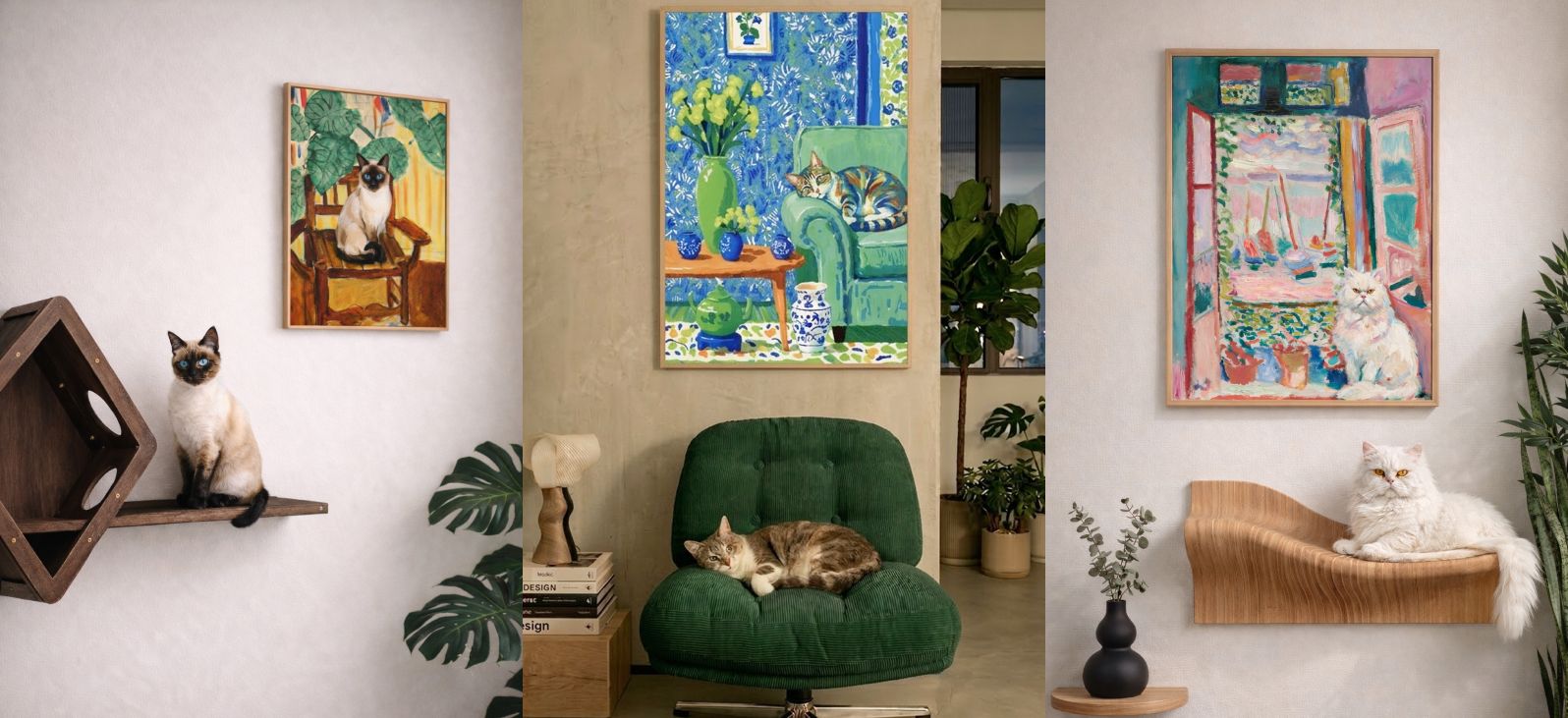
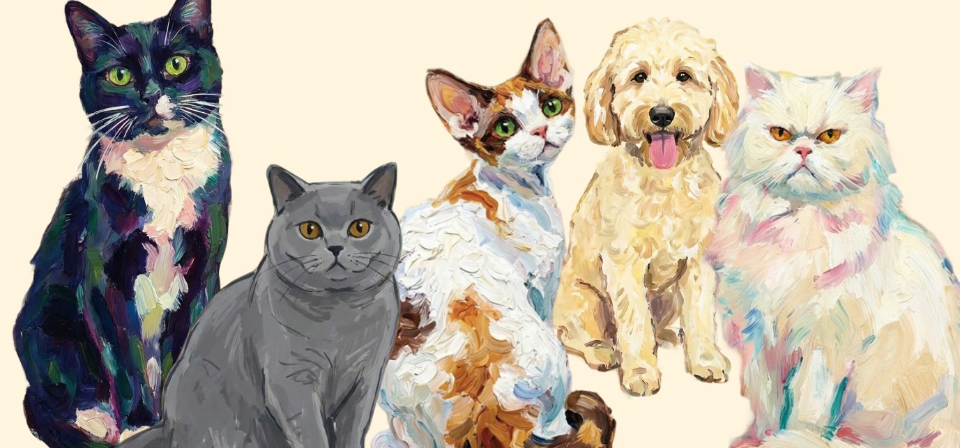
The Three Impressionist Pet Portrait Styles and the Homes They're Made For
Every portrait at pet-art.shop is rendered in impressionist oil painting style, loose brushstrokes, luminous color, mood over strict realism. (For the full story on what makes impressionist style different from photorealistic custom pet portraits, and why it works so well for pets specifically, read: What Is an Impressionist Pet Portrait?)
Within that style, there are three distinct visual worlds. Each has its natural home.
-
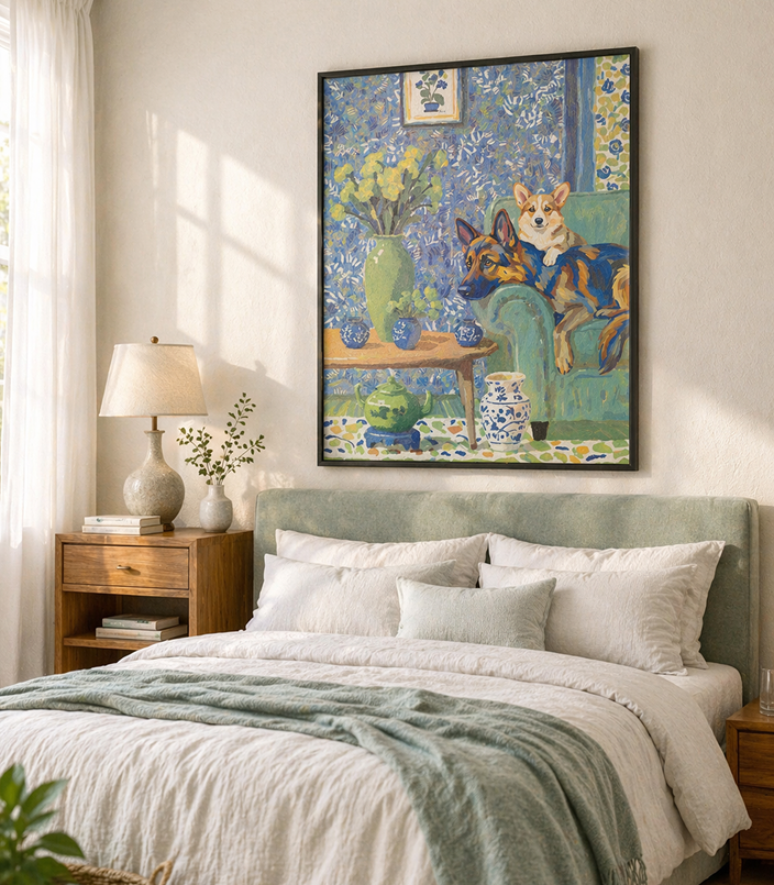
The Good Chair: Warm Gold and Amber
The palette here is warm yellows, amber tones, botanical greens, and the quality of afternoon light coming through a window. Think golden hour, permanently.
The Good Chair carries the warmth of an afternoon that never quite ends, amber, gold, botanical green, the particular orange of sunlit wood. What makes it work in a room isn't contrast. It's resonance.
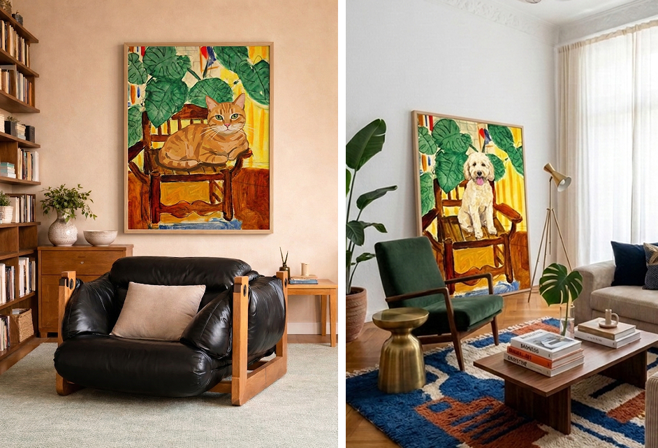
The orange tabby above a black leather chair: the ochre in the brushwork pulls warmth out of a room that could easily read cold.
The goldendoodle leaning against a white wall, a green velvet chair beside it, brass lamp glowing nearby, the painting's yellows and the brass don't match, but they're in the same conversation, and the room knows it.
Then there's the grey wall, the walnut sideboard, the orange Eames chair. On paper, grey and orange shouldn't need each other. But the painting is the bridge, its amber and orange connect the warm chair to the cool wall, and suddenly the whole corner makes sense.
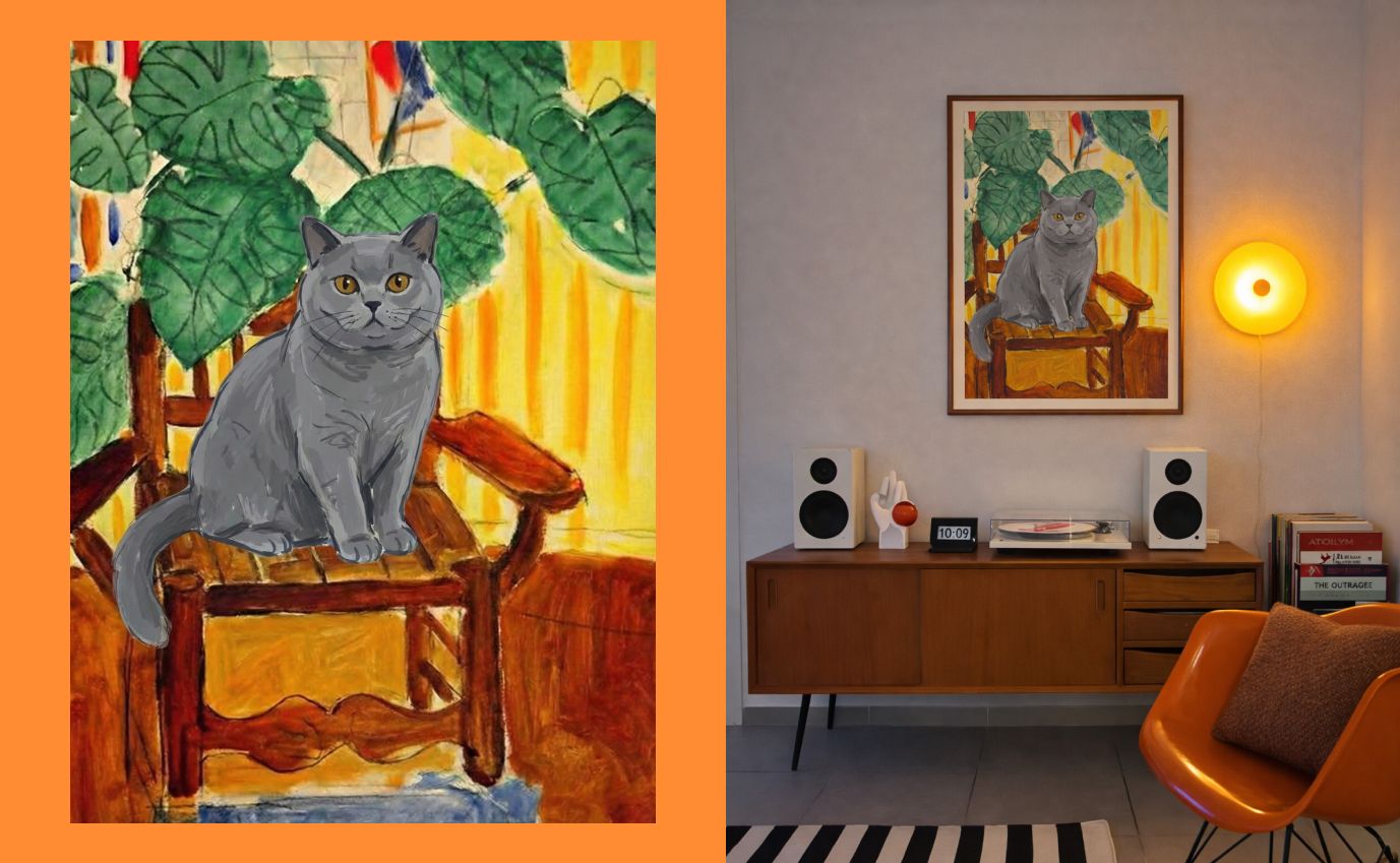
The one connection you're looking for is something in the room that shares the painting's warmth, a wood floor, a warm-toned chair, a brass accent, a single plant. It doesn't need to match. It needs to rhyme. Once that echo exists, the painting feels chosen, not placed.
-
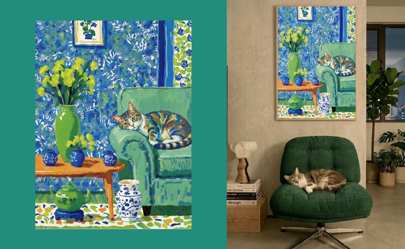
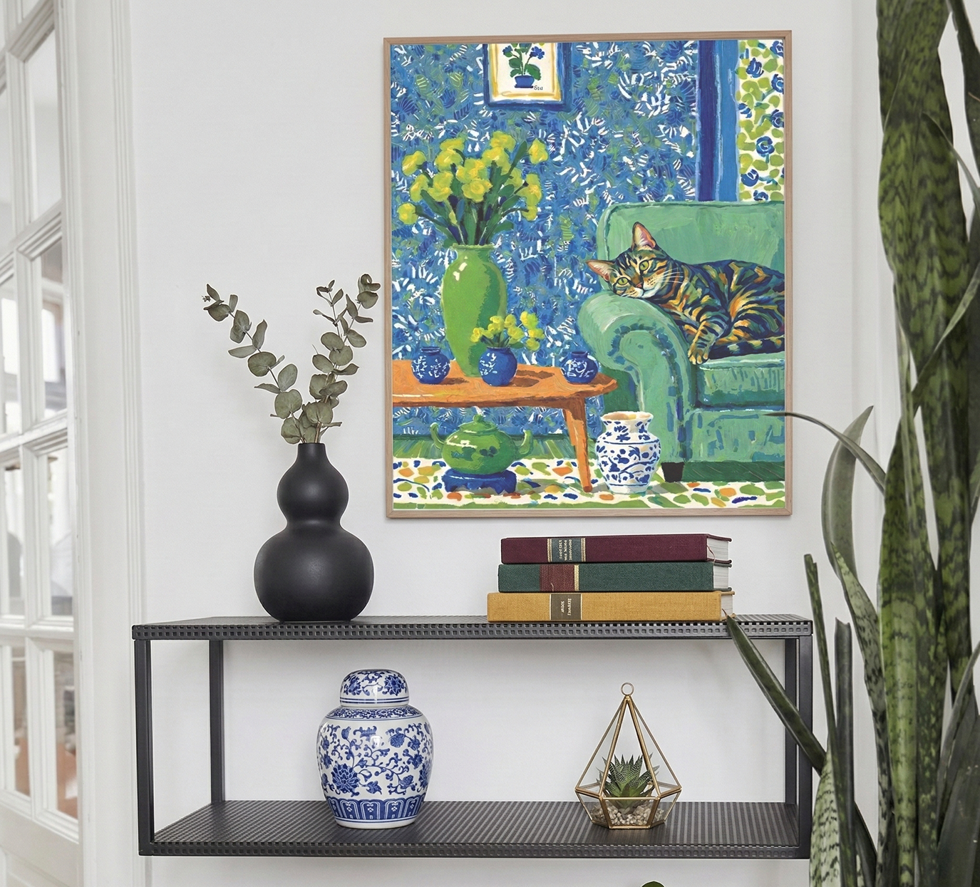
The Art of Doing Nothing: Cool Blues and Soft Greens
The Art of Doing Nothing carries a quieter kind of color, cool blues, layered greens, the stillness of a room that isn't trying to impress anyone. What makes it work isn't contrast either. It's the same principle: find something in the room that shares its register, and let the two speak quietly to each other.
Above a black console table with blue-and-white ceramics, the painting's blues don't fight the room, they complete it. The chinoiserie in the brushwork and the porcelain on the shelf are having the same conversation in different mediums.
Against a bedroom with a sage green headboard, the painting's greens and the linen's softness fold into each other so naturally it looks like they were always meant to be together.
The one connection you're looking for is something cool, quiet, or botanical, a green plant, a blue ceramic, a grey-toned textile, a linen headboard. It doesn't need to be an exact match. It needs to feel like the same exhale.
-
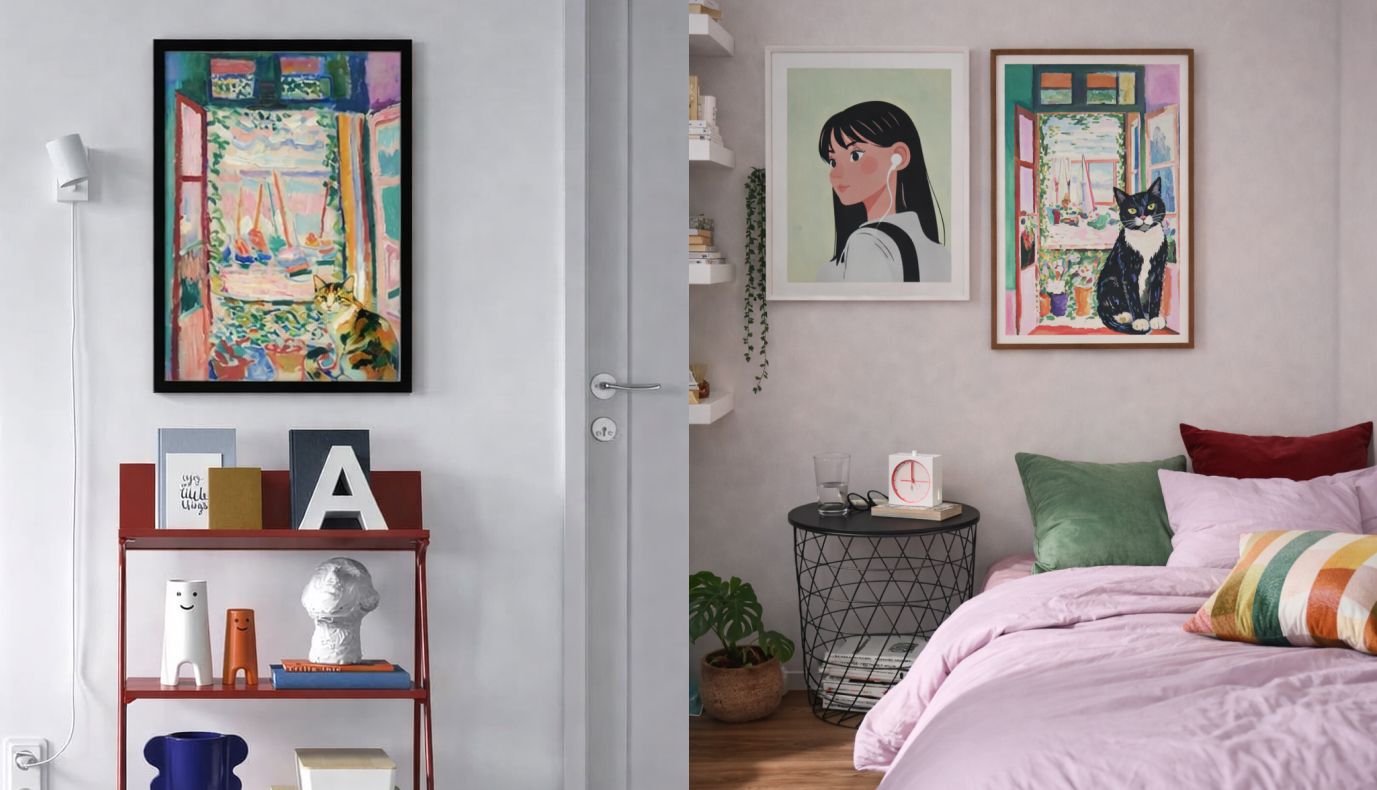
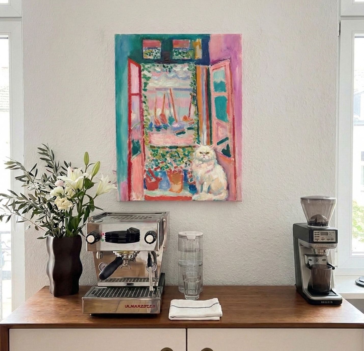
Open Balcony: Mediterranean Purple and Warm Terracotta
Open Balcony is the most saturated of the three, Mediterranean pinks, warm terracotta, bursts of teal and coral, the particular light of a room where the window is always open. It looks like it needs a careful room. It doesn't. It needs one thing to catch it.
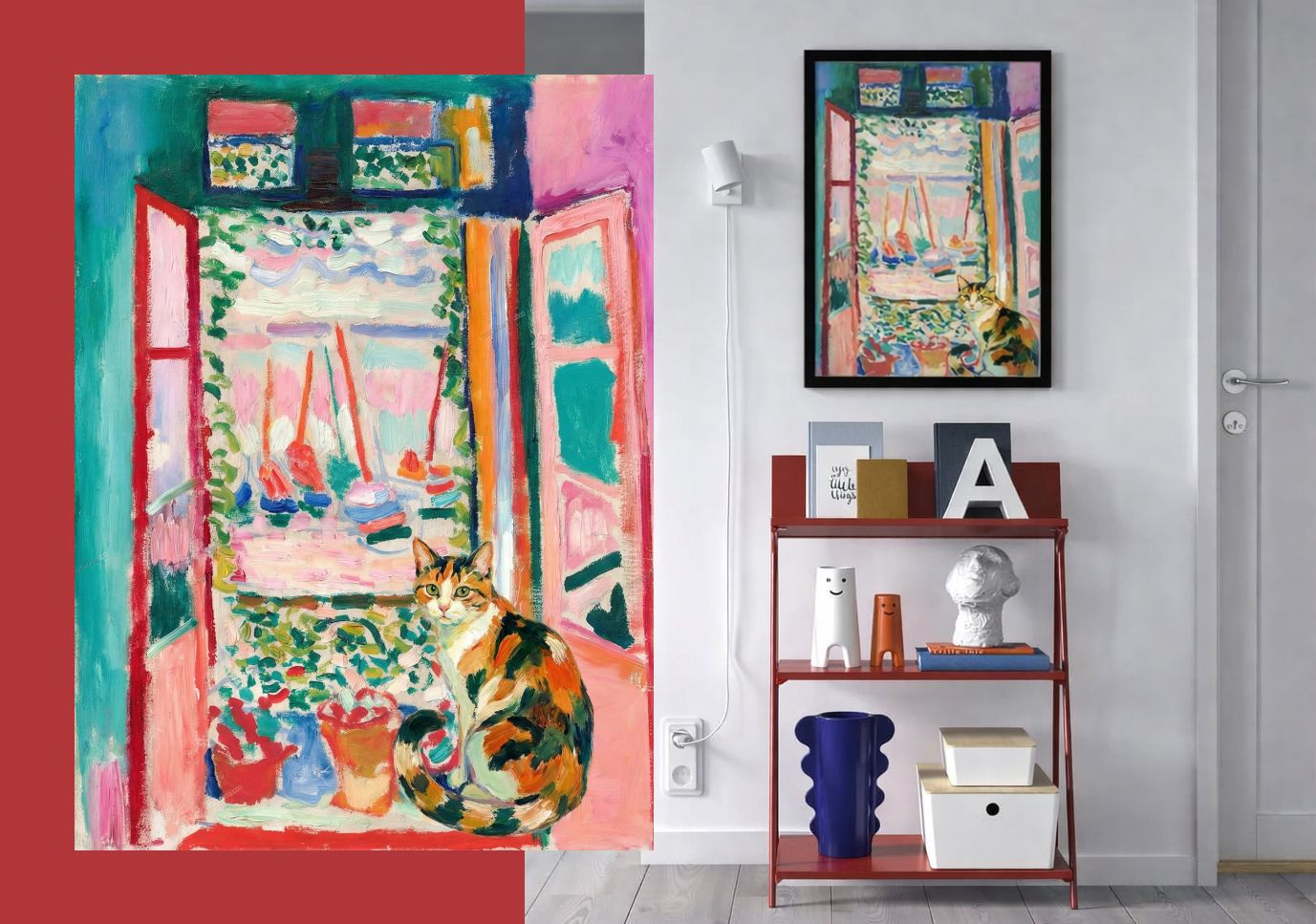
Against a white wall above a warm wood counter, the painting carries the entire corner on its own, the white gives it nowhere to hide and everywhere to go. On a grey wall in a bedroom with pink bedding and a green cushion, something unexpected happens: the painting's pinks land on the bed, its greens land on the pillow, and the whole room feels like it was designed around a painting that arrived after everything else. Next to a rust-red shelf, the terracotta in the brushwork and the metal frame become the same color from across the room.
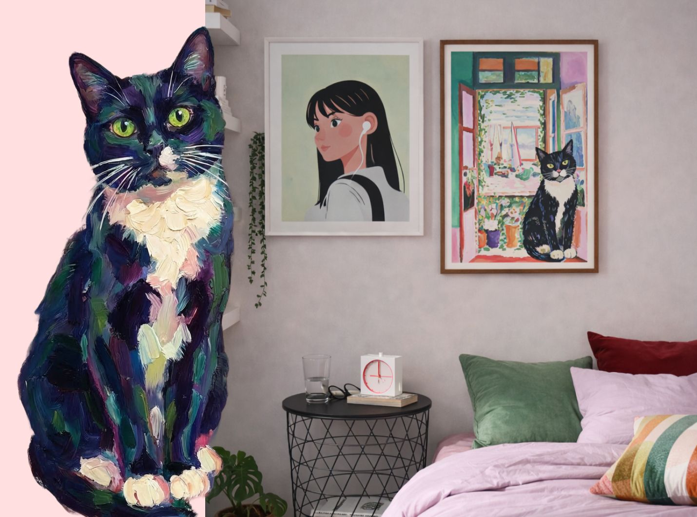
The one connection you're looking for is a single color in the room that the painting already contains, a pink cushion, a terracotta pot, a teal vase, a warm wood surface. Once that echo exists, the rest of the room rearranges itself around it.
-
The Part That Makes It Last
The impressionist pet portrait works as a gift because it doesn't try to be cute. It tries to be beautiful. It treats the pet as a subject worthy of art, not a novelty, not a joke, and gives the owner something they'll explain to guests for years.
That's the thing about the impressionists. They weren't painting kings or battles. They were painting the ordinary things that made life feel worth living: a garden, a boat, a child, a cat asleep in the sun. The same instinct that made those paintings matter is still at work here.