Art Advice: How to Style Your Living Room with Pet Art
Published: 7/18/2026
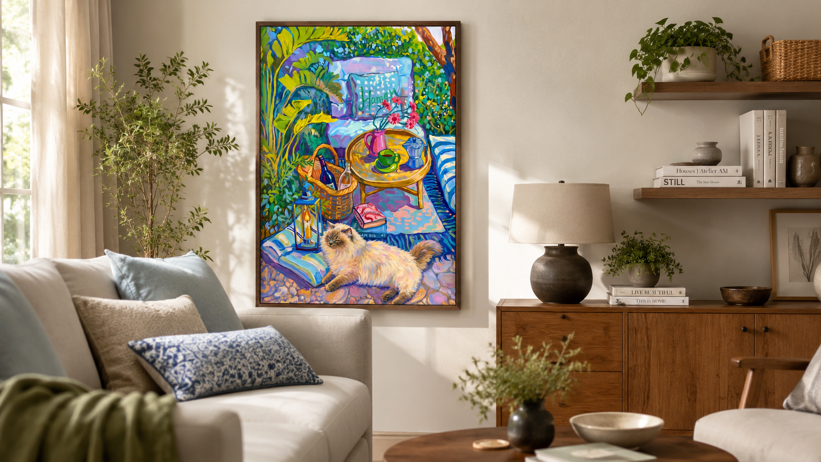
The living room is where people spend the most time together, and where a wall of art gets looked at, talked about, and lived with every day. It's one of several rooms we've styled with pet art across the house, from entryways to bedrooms, but the living room comes with its own set of questions. Here is how a few real living rooms found the right piece, the right size, and the right spot for it.
-
Find It a Corner, Not a Command Performance
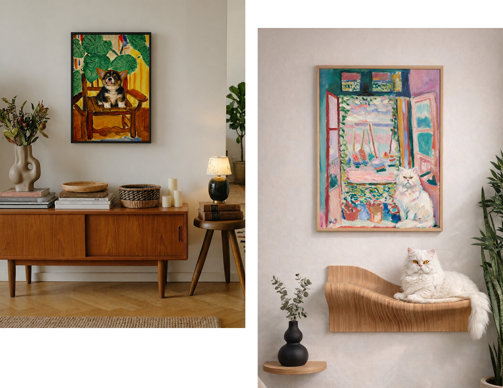
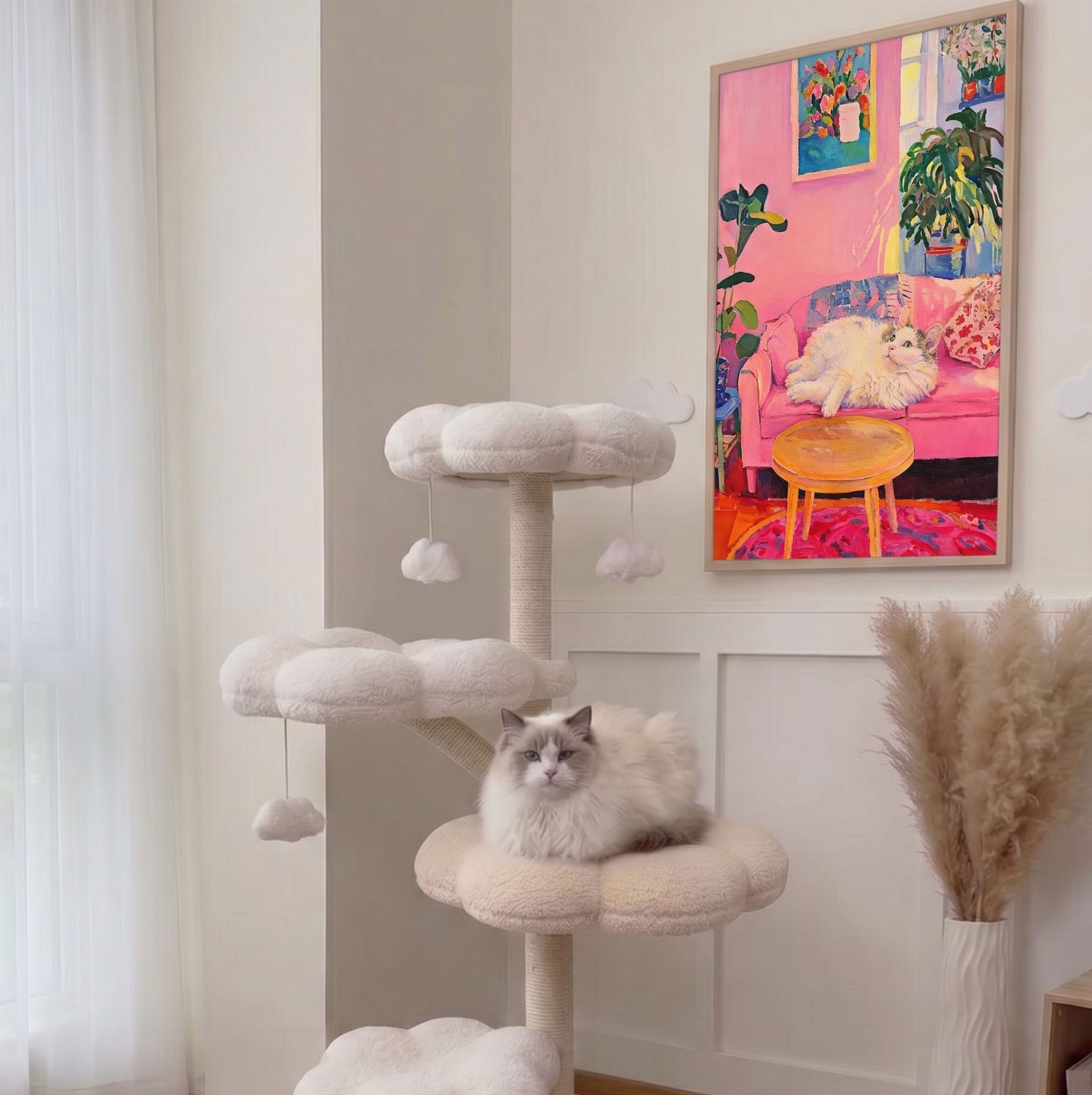
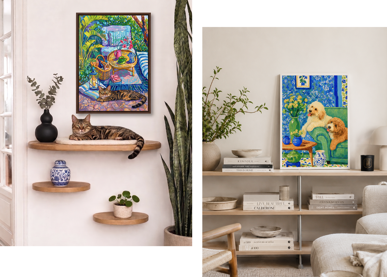
A big blank wall behind the sofa isn't the only spot for it, and often not the easiest one to get right. A shelf works. So does the wall next to a chair with some personality, or the empty spot by a cat tree where your cat already spends half the day.
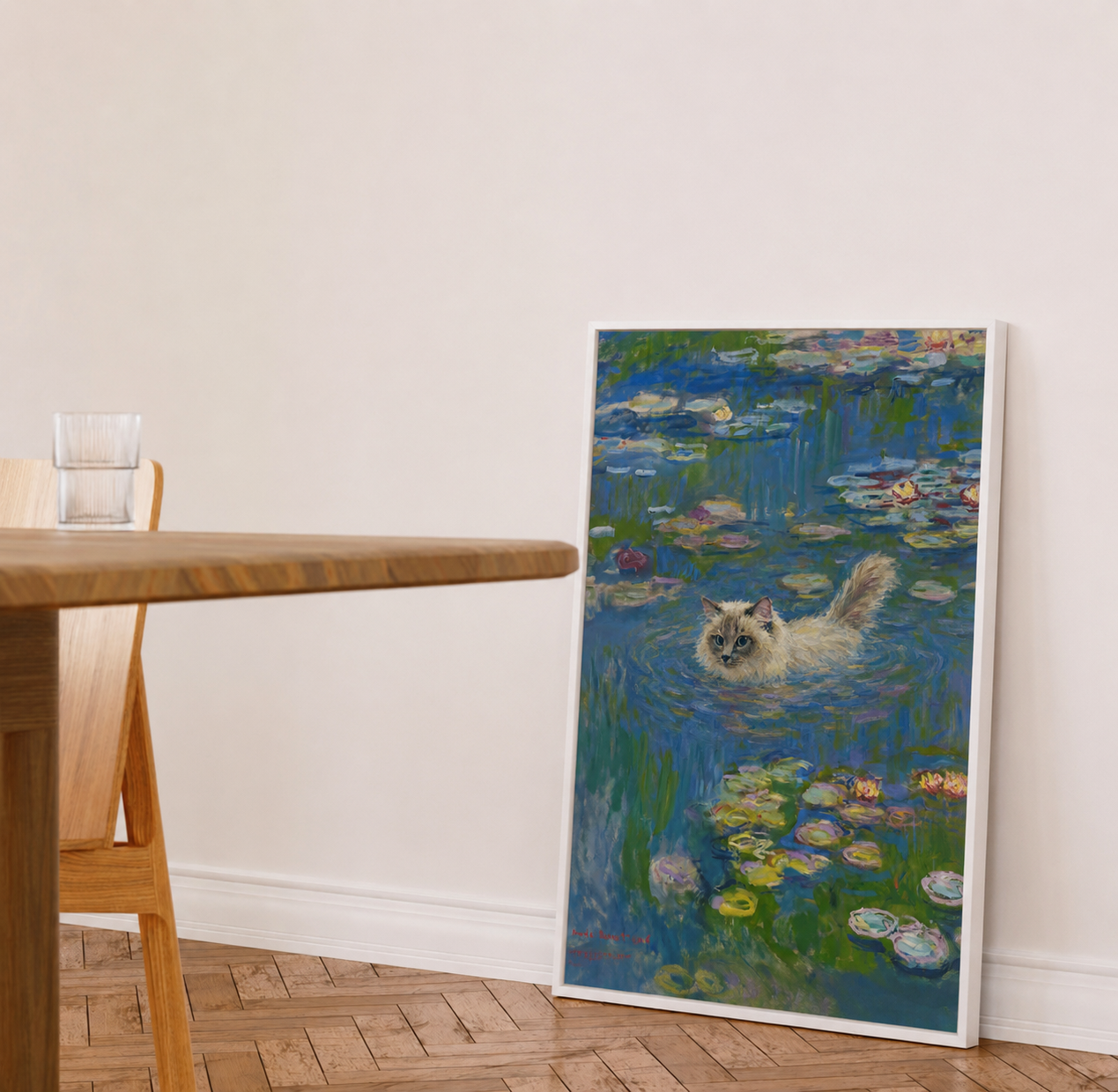
Even the floor works, leaned against a bookcase or a console, no measuring, no nail holes.
-
Why Pet Art Works Especially Well Here
Living rooms are where guests spend the most time, which makes the art on the wall part of the conversation whether it's meant to be or not.
A pet piece painted in an impressionist style reads closer to fine art than to a photograph, so it holds its own next to real furniture instead of looking like a framed snapshot.
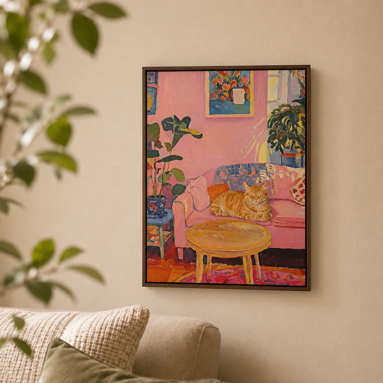
The soft brushwork also sits more comfortably with wood tones, linen, and neutral fabric than a sharp, high-contrast print would.
-
Warm Neutrals Work Beautifully
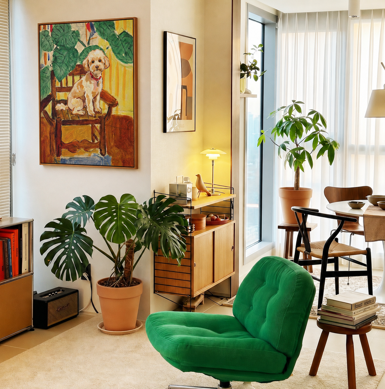
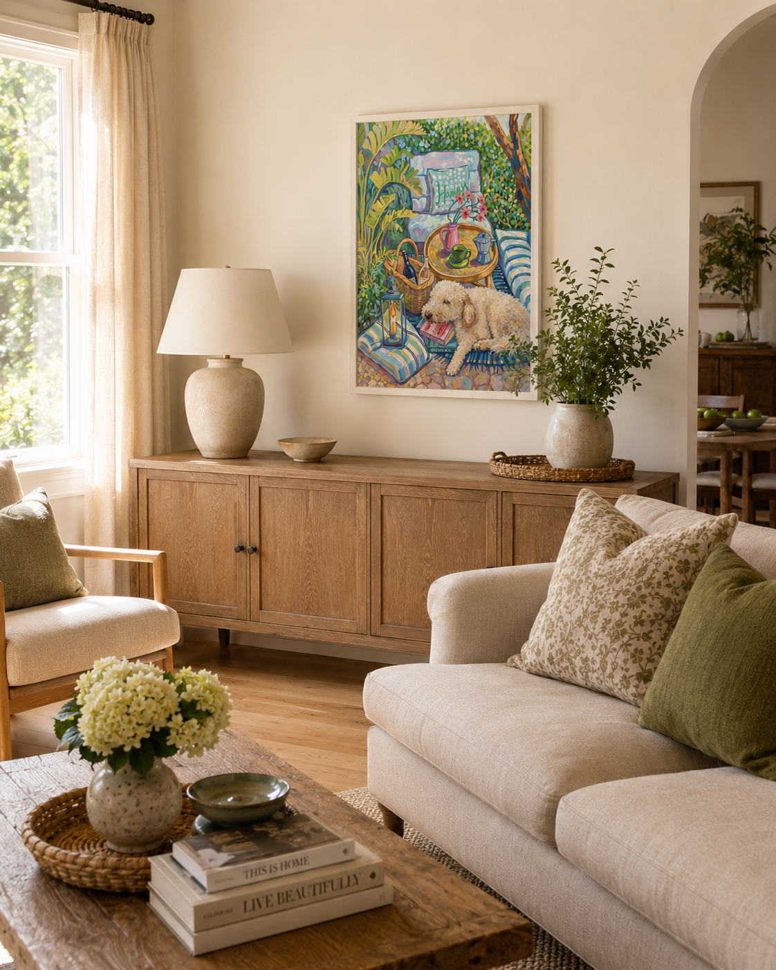
A room with oak floors and neutral upholstery holds up well against soft golds and greens, the kind of palette that shows up in scenes like The Good Chair or Afternoon Garden. The art doesn't need to match the furniture. It just needs one or two colors in common with it.
-
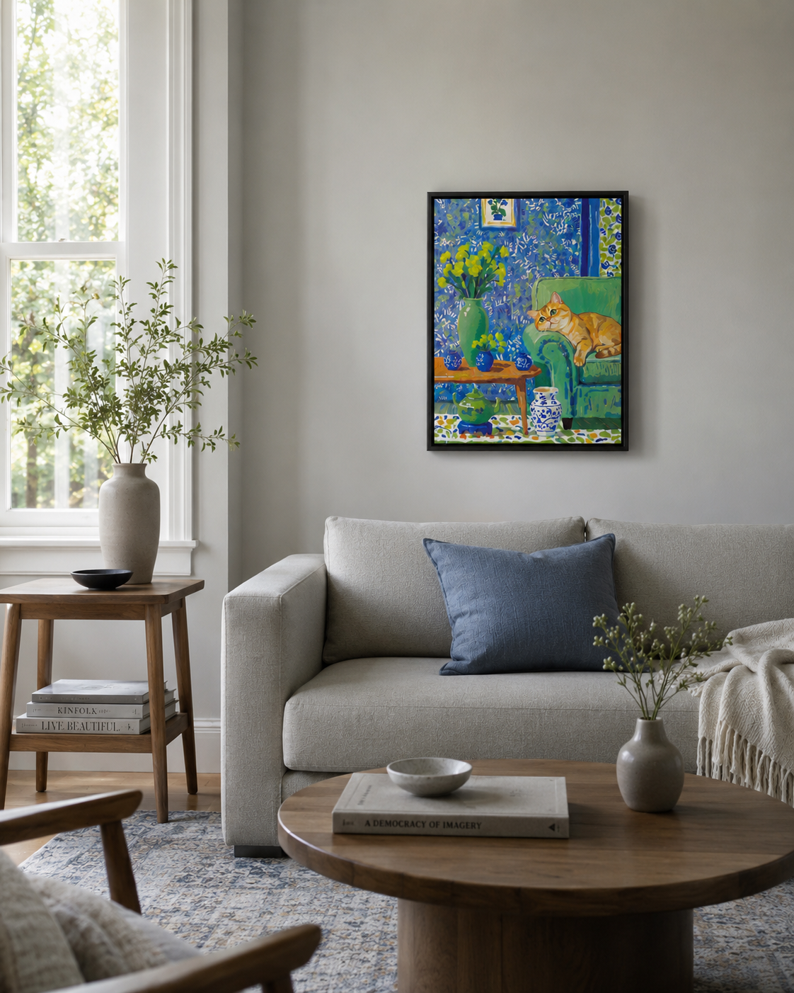
Cooler Spaces Feel Calmer With Muted Tones
A more minimal living room, especially one with cooler grays or blues, tends to feel more settled with a piece like The Art of Doing Nothing or Water Lilies rather than something bright or high-contrast.
-
Choosing a Frame Color
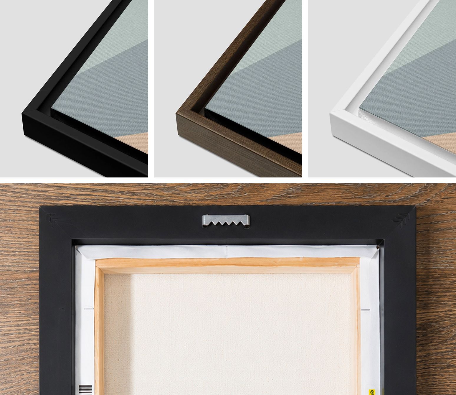
Frame color changes how a piece sits in a room more than most people expect. Black gives it a more defined, contemporary edge. A walnut or brown frame feels warmer and blends into rooms with wood tones already in play. White keeps the focus on the piece itself, especially against a light or neutral wall.
-
Let It Share the Shelf
If it's going on a shelf or console rather than the wall, it doesn't need to stand alone. Prop it behind a stack of books, next to a plant, or beside whatever's already sitting there. It reads less like a display piece that way and more like something that's actually part of the room.
-
More Rooms, More Ideas
Living room is just one piece of the picture. See how the same styles look in bedrooms, dining rooms, kitchens, and bathrooms across our full room-by-room gallery.
-
Can pet artwork look modern in a living room? Yes, especially in an impressionist style. The soft color and brushwork read more like fine art than a photo, which is what makes it sit comfortably in a contemporary room.
Can you hang pet artwork above a sofa? Yes, though at this size it tends to look more intentional centered above a console, sideboard, or accent chair than stretched across a full three-seat sofa. Either way, leave 6 to 8 inches of space above whatever furniture sits below it.
Can I mix two different art styles on the same wall? It can work, but because each style is its own detailed scene rather than a neutral pattern, two very different ones can compete for attention. If a wall needs more than one piece, repeating the same style in two sizes usually reads more intentional than pairing two unrelated scenes.
What kind of frame works best for a living room? Black adds a more contemporary edge, walnut works naturally with existing wood tones in the room, and white keeps the focus on the piece itself against a light wall.